How to Create a Parliament Chart in Power BI (The Easy Way)
Learn how to create a professional Parliament Chart in seconds in Power BI - no coding required!
If you have ever tried to visualize election results or legislative data in Power BI, you know the struggle. You want that classic semi-circle "hemicycle" layout—the kind you see on major news networks during election night—but Power BI’s native visual library leaves you stuck with basic pie charts or bar graphs.
For years, analysts had to rely on complex workarounds, hacking together scatter plots with tricky trigonometry (DAX sines and cosines) just to get dots to line up in an arch.
Fortunately, there is now a much faster, cleaner, and professional way to build this. In this post, we’ll look at Chartpad’s Parliament Chart for Power BI, a custom visual that does the heavy lifting for you.
What is a Parliament Chart?
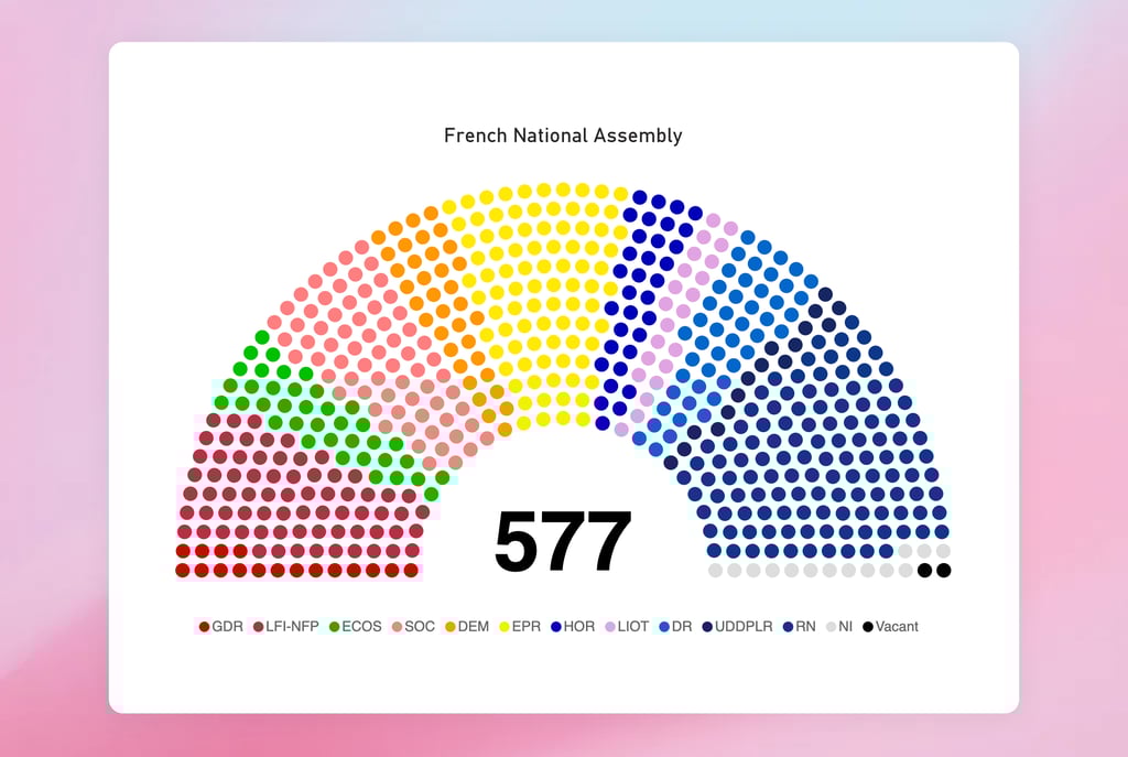
A parliament chart (or hemicycle chart) is the standard way to visualize the composition of legislative bodies. It arranges seats in a semi-circle, often grouped by political party or coalition, to show the balance of power.
It is an essential tool for:
Government Analysts: Tracking legislative dynamics.
Journalists: Reporting on election outcomes.
NGOs & Researchers: Visualizing coalition scenarios and policy influence.
The Problem with Native Power BI Visuals
Native Power BI visuals don't support this specific layout out of the box. While you can approximate it with a donut chart, you lose the "individual seat" granularity that makes parliament charts so effective. Workarounds often involve:
writing complex DAX formulas to calculate X/Y coordinates for every seat.
Manually creating SVG images.
Dealing with slow rendering times on heavy datasets.
The Solution: ready-made Power BI visual
The Parliament Chart by Chartpad is a premium custom visual designed specifically to solve this problem. It renders assembly-style seating layouts as interactive charts without requiring you to write a single line of geometry code.
Key Features
After testing the visual, here are the standout features that make it a "must-have" for political reporting:
Data-Driven Hemicycle Design: The visual automatically generates the semi-circle layout based on your data. You don't need to calculate coordinates; just drag and drop your fields.
Automatic Grouping & Coloring: It natively understands how to group seats by political party or coalition, applying your specific color codes automatically.
Full Interactivity: Unlike static SVG images, this visual is fully interactive. It supports native Power BI filtering, cross-filtering, and tooltips. If you click a party in the parliament chart, it filters the rest of your report.
Customizable Formatting: You can tweak the styling to match your organization’s branding, making it perfect for official government reports or media publications.
How to Get Started
Download the Visual: Go to the Microsoft AppSource marketplace and search for "Parliament Chart" or click here to get the Chartpad Parliament visual directly.
Import Your Data: You need a simple dataset with your party names and the number of seats (or individual representatives).
Drag and Drop: Add the visual to your canvas. Drag your "Party" field to the Legend well and your "Seat Count" field to the Values well.
Customize: Use the format pane to adjust the colors to match the real-world political parties (e.g., Red for Labour, Blue for Conservative, etc.).
Conclusion
If you are building an election dashboard or reporting on legislative data, stop fighting with scatter plots and trigonometry. The Chartpad Parliament visual offers the most professional, plug-and-play solution currently available on the marketplace.
ChartPad
Transforming data into actionable business insights.
LEGAL
Connect
ChartPad Ltd.
71-75 Shelton Street, London, England, WC2H 9JQ
hello@chartpad.io
© 2025 ChartPad, Ltd. All rights reserved.